Copy the link to a markdown format of this article for ChatGPT, Claude, Gemini, or your favorite AI.
Landing pages may be simple, short pages on your website, but they do a lot of heavy lifting. They can generate leads or encourage sales. And when done right, they can engage your customers and entertain them. A lot of work goes into a good landing page. That’s why we’re sharing these landing pages we love and why they work.
Benefits of Landing Pages
Landing pages serve a unique purpose but fall into two different categories: pages for lead generation and click-through pages.
Lead generation pages exist to collect email addresses from your customers in exchange for something free, like a discount code or a free download.
Click-through landing pages aim to get customers to click a button and go to the next page. These are pages where people click to book a call, then are taken to a scheduling page. Or they may click the buy button and go to the checkout page.
While you may pepper similar calls to action throughout your content, landing pages have a distinct advantage over other pages on your site.
Landing pages are useful for:
Increased Conversions. The focus of landing pages is singular, so your customer can’t get lost in the content on the page. A landing page has a single goal, communicating about just one thing. So, customers are more likely to complete the desired action the page guides them to take.
Improved Brand Authority. A good landing page offer shows your customer that you understand them and their needs. It will lead them to trust you more in the future.
Easier A/B Testing. Because landing pages are short, you can easily create two versions and see which performs best. A/B testing helps you better understand what your audience responds to, helping you create better landing pages and increase your conversions even more.
Access to Valuable Data. Landing pages make it possible to get information about your customers. For example, a landing page dedicated to encouraging customers to sign up for your email list is a great way to get their email and get your customers to click check boxes about what they’re specifically interested in.
Expanded Visibility. Using SEO best practices on your landing pages can help increase organic traffic and potential conversions from a clear, direct page.
What Should Be on a Landing Page?
You’ve probably seen a ton of landing pages. If you know a landing page when you see one, you may have noticed some elements they all seem to share. Here’s a list of things you must have on your landing page to increase conversions.
Single Purpose
Unlike your home page, a landing page exists for a single purpose – to get conversions. So don’t distract customers with too many links or options to navigate away from the page. You want to make sure they know and want to take the action you desire.
Landing pages need to communicate their purpose clearly to the customer. This purpose should compel the customer to follow the call to action. So, when making landing page mockups, ensure every element you add supports this single purpose.
Compelling Headline
The headline is the first thing your customer will read when they hit your landing page, so it should convey what they stand to gain from what you’re offering.
Make it clear and punchy. The headline is no place to try out your stream-of-consciousness poetry. Instead, use it to tell your customer what makes this particular offer on the landing page so special.
It’s the first place on the landing page where you get to tell the story of your offer. Make sure you hook them with the headline and use a sub-headline to clarify that hook and keep them interested.
Engaging Images
Your landing page is no place for silly, generic stock images. Choose visuals that show off your products or services or convey customers’ emotions after using your product.
Pay special attention to the details in the images. Landing pages need to make first impressions quickly, and every detail counts.
The images you choose help tell the story just as much as your compelling headline. So, pick visuals that will resonate with your ideal customer. You want your customers to see themselves in your images to feel closer to your offer.
Many agencies still build landing pages for themselves and others but don’t use alt text for screen readers. Ensure all images on your pages utilize alt text and describe the photos so each is accessible.
Clearly Stated Benefits
The benefits of your offer take your customers further into the story and show them how your offer will improve their lives.
The key to making this section of your landing page hit home is to share the features of your product or service and directly relate them to the benefits your customers will gain from using your product or service.
Outlining the benefits in a bulleted list is best because it makes them easier to read. You don’t want to overload your landing page with large blocks of text.
For example, here’s what it might look like in action for a company that makes fitness trackers:
Accurate Sleep Data: Our fitness trackers monitor your sleep stages, so you know how much rest you’re actually getting.
Motivation: Our trackers give you a buzz notification to remind you to get up and move.
Accountability: Stay on top of your workout habit with accurate information about how many calories you’re burning.
Social Proof
Social proof is evidence that others have already taken part in your offering. If you’ve ever looked at product reviews or searched through product hashtags on Instagram before making a purchase, you’ve used social proof to help you decide.
Ask past customers for testimonials to share on your landing page—don’t forget to ask them for a headshot and if you can use their real name. The more authentic your testimonials, the more a potential customer will trust you.
You can also embed or screenshot social media comments for social proof on your landing page.
And, of course, don’t forget the logos of companies you’ve worked with or organizations that have recognized your products or services. That kind of social proof is landing page gold.
Sense of Urgency
If there’s no deadline, people likely won’t take action. Even if it’s an offer they need, they may scroll away from a landing page because they feel like the offer will always be there. So, to grease the gears a bit, give your potential customers a sense of urgency. Let them know this offer won’t last forever.
Use an ending date and/or a countdown timer until the offer closes on the page if it’s that urgent. Creating a sense of urgency will get customers to take action faster, increasing conversions.
Call to Action
Now, this is the place on the landing page where you tell your customers what you want them to do. Do you want them to sign up for your email list? Do you want them to click to schedule a call? Do you want them to hit the buy button so they go to a checkout page?
The call to action you choose depends entirely on the single purpose of the landing page, so make sure it matches that purpose, and keep this call to action visible above the fold of the landing page, so customers know what to do without having to scroll.
Only use that one consistent CTA throughout the page, even if you post it multiple times. You don’t want to confuse customers about how to get the offer or what to do next.
Examples of Landing Pages We Love
It’s one thing to know the elements of a landing page and another to see it all in action. Here are some landing pages we love, and we think you will too.
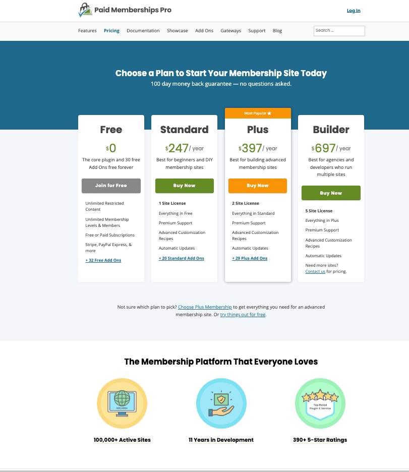
The Paid Memberships Pro Pricing Page
Why It Works: The headline is clear, and the subheading lets you know there are no strings attached to the offer. Paid Memberships Pro clearly lays out all the plans they have to offer, then follows it up with social proof.
DoorDash
Why It Works: The hero image is bright and shows you some food possibilities available to you with DoorDash. And the page makes it easy to take action and find food near you by allowing you to enter your home address right below the headline.
DoorDash Driver Sign-Up Page
We promise we don’t have some kind of deal to promote DoorDash. We wanted to show you two different examples from the same company.
Why It Works: The page for drivers to sign up with DoorDash is entirely different from the landing page for customers looking for a meal. This landing page excels because the headline and benefits enforce how great it can be working for DoorDash, and the image features a smiling delivery driver. Photos of actual people using the product or service are always best for converting. The directions are simple, and the page shows the user where to put their information and click next.
Disney Plus
Why It Works: Disney Plus has been killing it with new Marvel and Star Wars shows, and they know it. So rather than sharing a revealing hero image full of spoilers from shows, they keep the details locked down. The page features images from popular shows and movies that fade into the dark background, leading your eye directly to the two options for signing up. Beneath that, they share what you get with your subscription and remind you about all the incredible shows you’re missing if you don’t sign up.
Substack Finance Writers Page
Why It Works: Rather than having one simple sign-up page for every potential writer, Substack has individual pages for popular topics, allowing them to share their unique value to that particular industry. The image and headline are clear, and there’s a clear sign-up button beneath it, followed by a quote from one of their most successful finance writers. This landing page exemplifies how minimal these pages can be and still be effective.
Zillow
Why It Works: Homeownership is a dream for many, and Zillow knows it. They choose hero images of ideal homes that many people would love to have. The headline outlines the process of finding your dream home, and the search bar allows you to pick your ideal area.
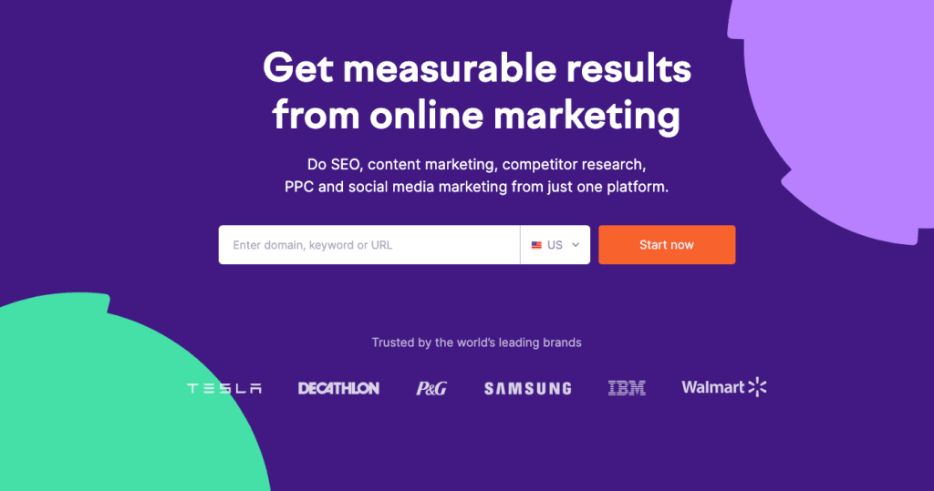
Semrush
Why It Works: Most website owners know they need SEO as a part of their marketing efforts, but many of them are frustrated by all the various platforms they have to sign up with to get the data they need to create a marketing plan. Semrush knows this, and their headline and subheading convey how easy it can be to get all the data you need in just one place if you work with them. In other words, they immediately recognize the pain point and offer a solution. Then, beneath it, they display some of the biggest companies in the world that trust their products.
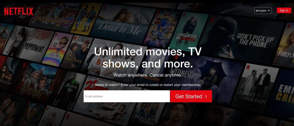
Netflix
Why It Works: Netflix offers a simple landing page. Their headline is clear, and the subheading clarifies the offer while minimizing the risk of trying their product. You have nothing to lose if you can cancel anytime, right? The images in the background feature popular shows that people are talking about on social media. And the simple call to action and get started button make it super simple to join.
Daily Harvest
Why It Works: Daily Harvest offers easy-to-prepare food options in the form of healthy meals, snacks, and smoothies. Their landing page to sign up has a strong headline and subheading that shares exactly what the company offers. The call to action encourages you to add your information to see if their product is available in your area. The image is clean and bright and showcases some of the food options you can enjoy when you sign up.
Milanote
Why It Works: Milanote is a collaborative digital whiteboard. Milanote appeals to creatives who want to organize visuals in a way that works for their workflow. The landing page has a clear headline, subheading, and a button that features the call to action. The image shows what it looks like to use Milanote. There’s even a quote from a user — all above the fold.
Surfshark
Why It Works: Surfshark opts for a more visual landing page than most, with little text. They know their ideal customer is an internet-savvy person, so they don’t waste time explaining what they do or what a VPN is. They share the huge discount they have to offer and use the image and subheading as a way to show how much this deal rocks. The button with the call to action stands out against the background, and the design is fun and playful.
Dropbox
Why It Works: Dropbox is a well-known and trusted brand, and its headline reflects that. The subheading clarifies why the brand is so popular, and the image shows what it looks like when you sign into your account. The button encourages you to click through and find the plan that works for you. Overall, the page is clear and direct, and they know they have a strong reputation, so they don’t spend time trying to convince potential customers they have something to offer.
Tips for Improving Landing Pages
After your landing page is live for a while, you’ll likely have some information about traffic and conversions. You can use this data to help you improve your landing page to increase your conversion rate. Before you create a second version of your landing page to run some A/B testing, here are some landing page elements to consider:
Update the Design. Consider all elements of your page’s design and what it says to your customers. Does it fit the tone you’re going for? Think about how the page design looks on a desktop and mobile. Does it work well? Would different colors, images, or text appeal to your customer?
Focus On the User. Are the benefits of the offer clearly stated? Think about the best way to convey these benefits in a way that will resonate with your user. Note that subtle is acceptable. Many of the landing page examples above have a direct offer with other implied messages.
Keep It Simple. Remember, your landing page has a single purpose and you want to communicate that purpose clearly. Don’t overload the page with text or complicated design elements.
Optimize for Mobile. Most customers will access your site and landing page from their smartphones. Make sure they can easily complete the call to action from their phone.
Utilize A/B Testing. Test new versions of your landing page against the old one and see which option converts more. It’s an extra step, but it will help you create the most effective landing page.
Include Social Sharing. Make it easy for potential customers to share your offer or information with others. Simple social sharing options will help you get more people to your landing page.
Professional Landing Pages Need Professional Hosting
Landing pages can increase conversions and help build brand authority, but not if your site crashes because your host can’t handle the traffic.
Pressable offers powerful managed WordPress hosting so you can focus on your business, not sitting on hold with tech support all day. We have different pricing options to fit the number of sites you run and your monthly traffic.
Sign up today to guarantee that your landing page will be reliable, fast, and secure.
Kevin MacGillivray is the Chief Marketing Officer at Pressable, where he’s focused on helping more creators build fast, secure, and successful WordPress sites. He’s driven to grow Pressable’s impact and make it the go-to choice for more businesses. Kevin enjoys making technology feel simple, useful, and inspiring through clear storytelling, creative experiments, and building new ways for the community to connect and thrive.
Kevin lives in Victoria, British Columbia, where you’ll often find him swimming in the ocean, exploring local trails with his dog, Minerva, or embracing the West Coast’s vibrant lifestyle and easy rhythm.
WordPress maintenance and support are crucial for keeping your website up and running. You wouldn’t drive a car 100,000 miles without changing the oil or rotating the tires. Routine maintenance is necessary to keep cars […]
If you’re planning to launch a new website, you should consider using WordPress. More websites run WordPress than any other content management system (CMS), with more than 60% of the top 100 top companies – […]
Did you know that 92% of customers on your website aren’t there to make an immediate purchase? Because of this, it’s vital that you learn who is coming to your site, even if they don’t […]